Who is HomeSphere-IQ for?
HomeSphere partners with building product manufacturers who offer rebates to over 2,600 builders on the HomeSphere program. It is a tool for their entire enterprise. It was designed to solve problems for their sales, executives, management, accounting and marketing teams.
Featured Project
What’s HomeSphere-IQ?
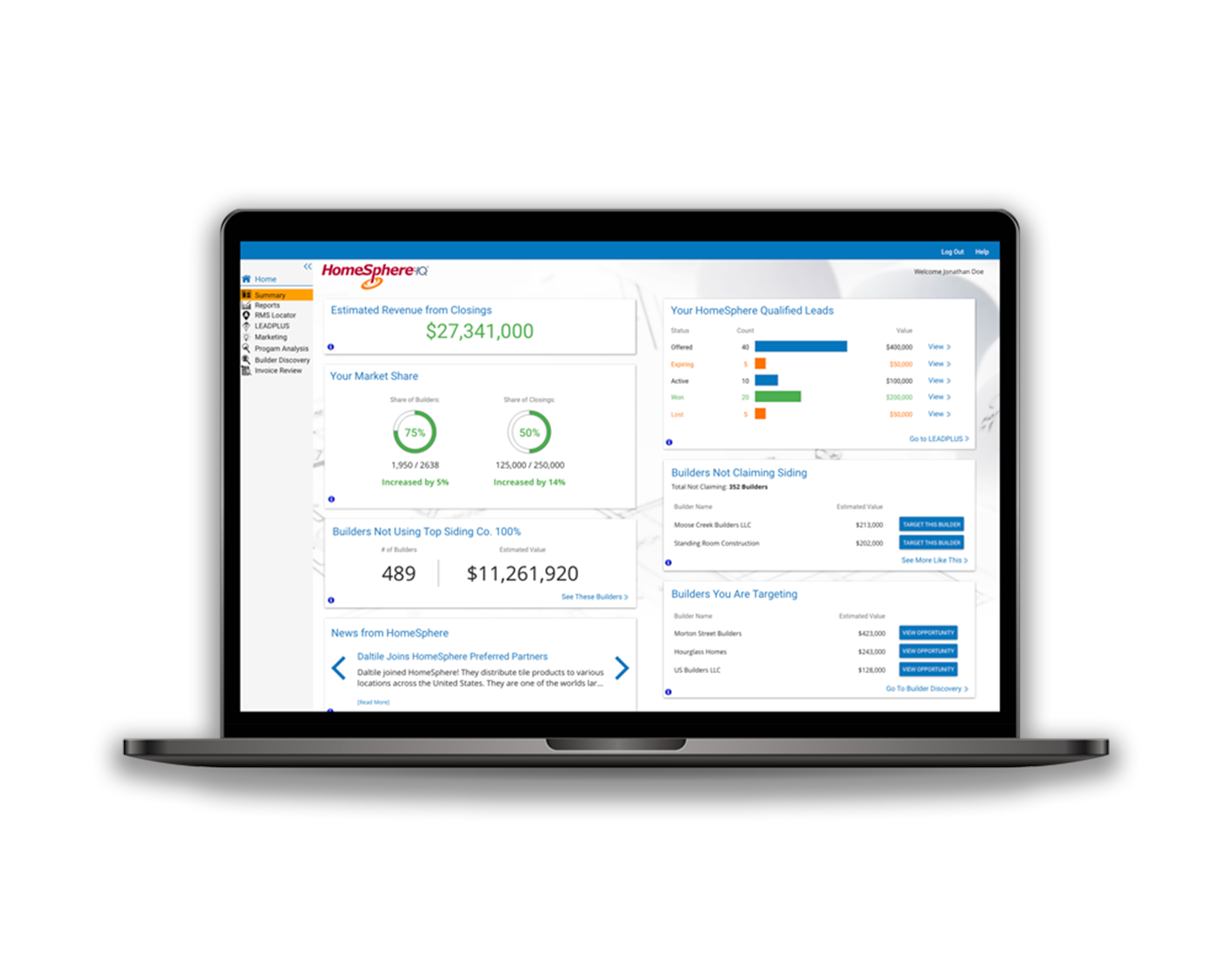
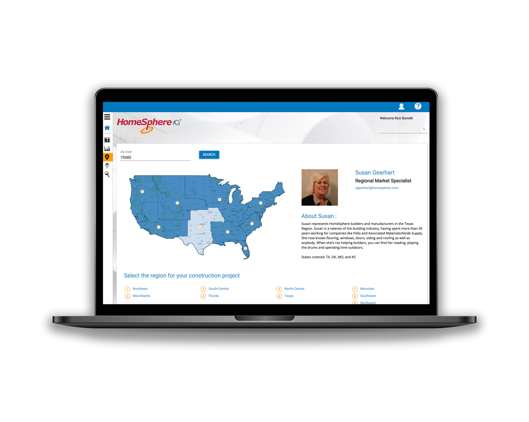
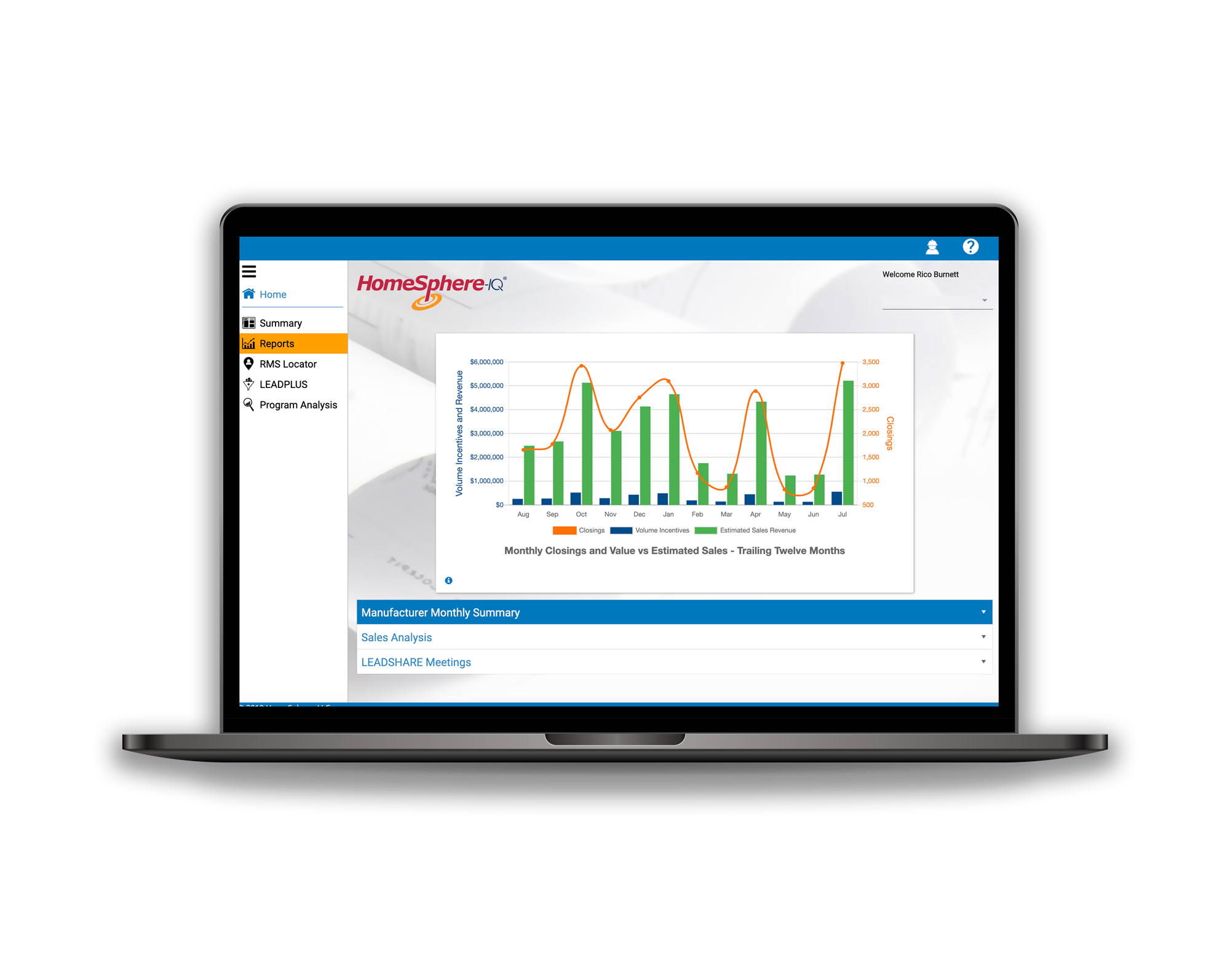
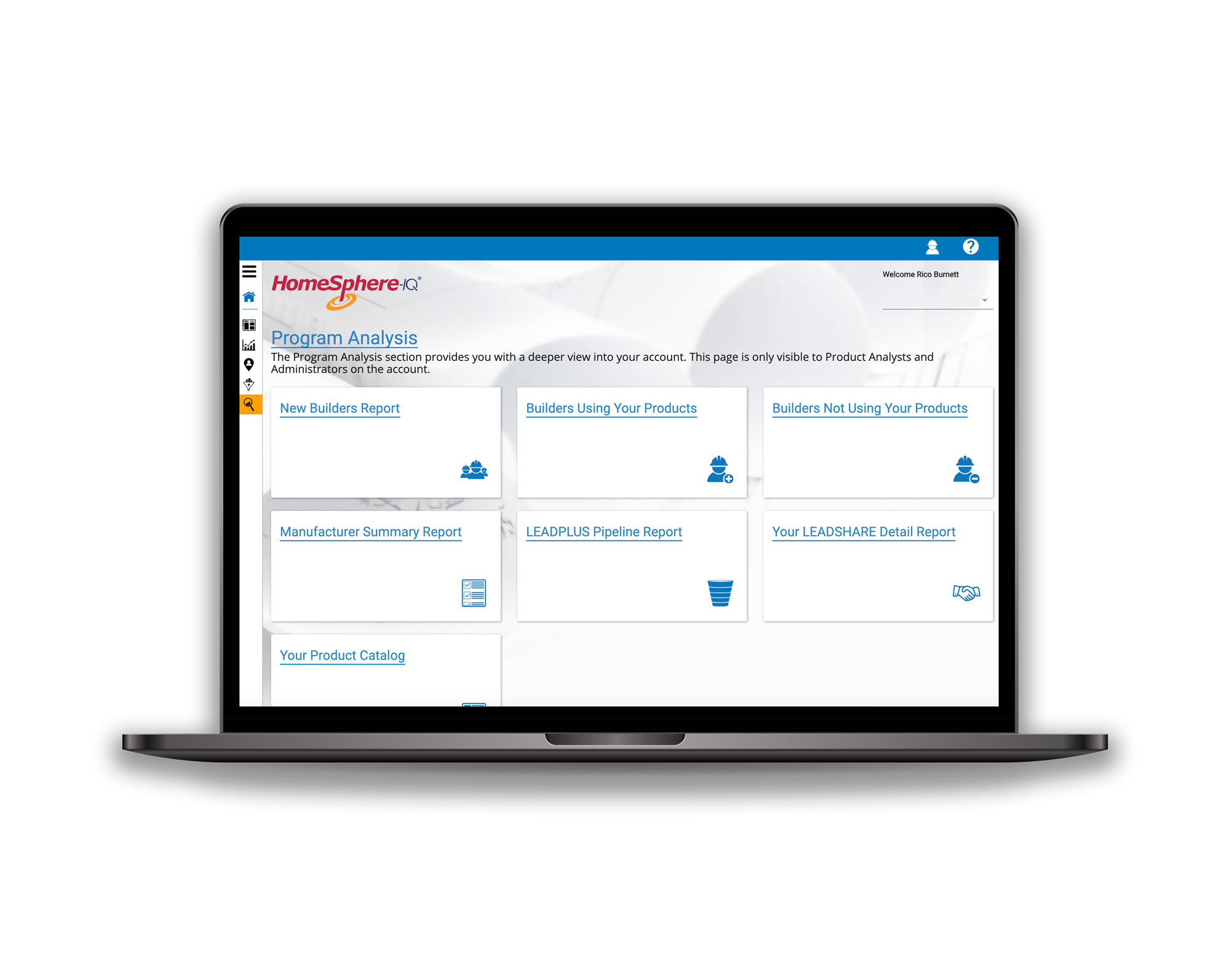
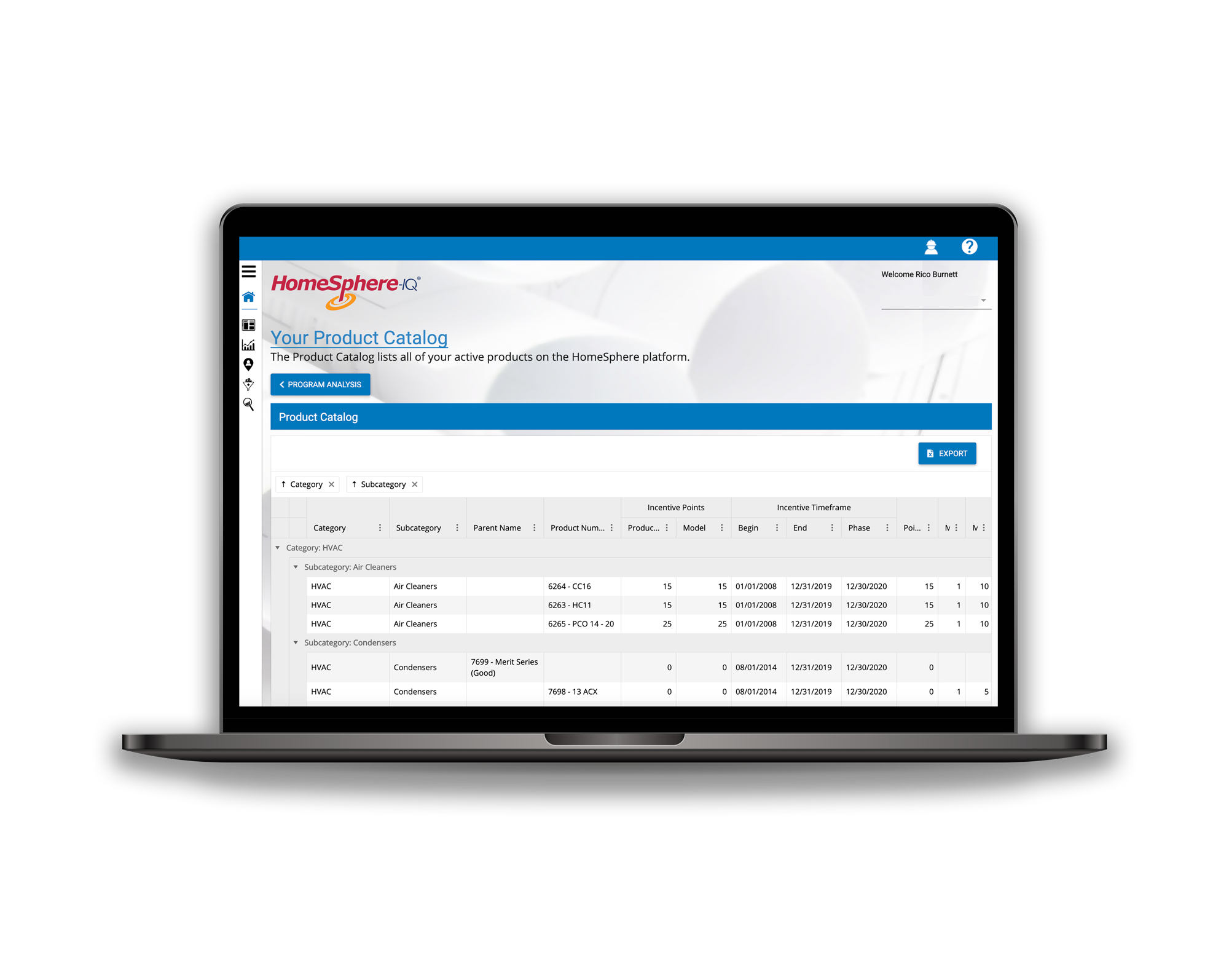
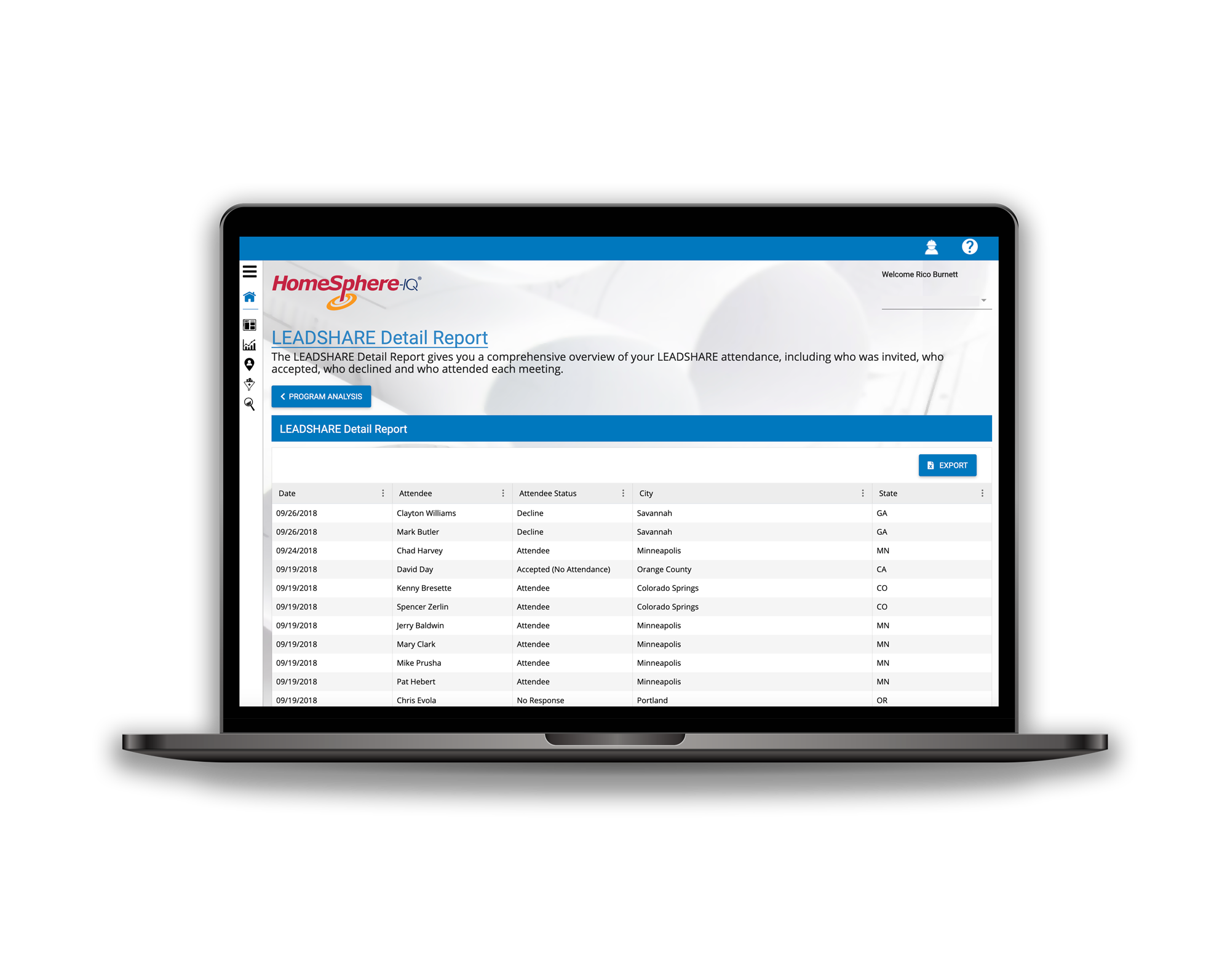
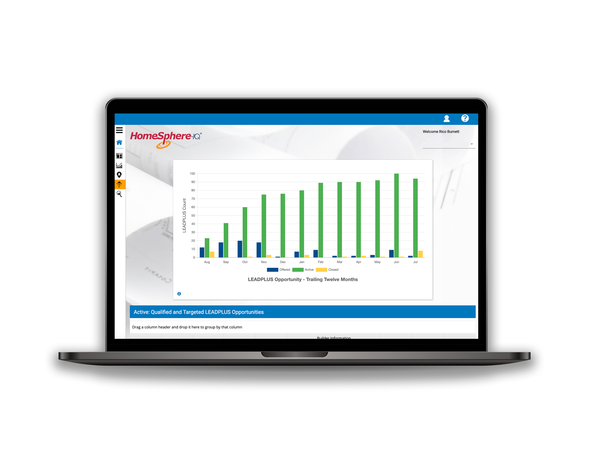
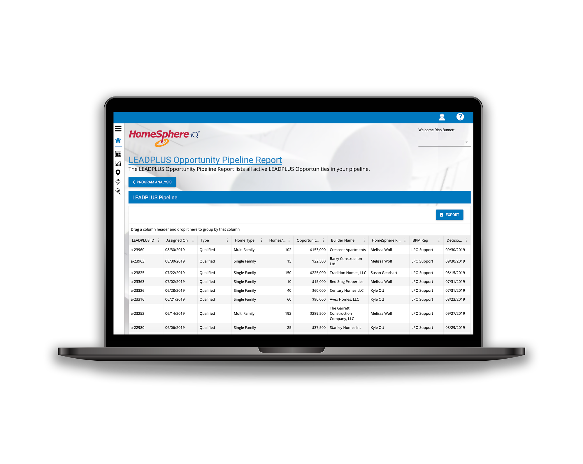
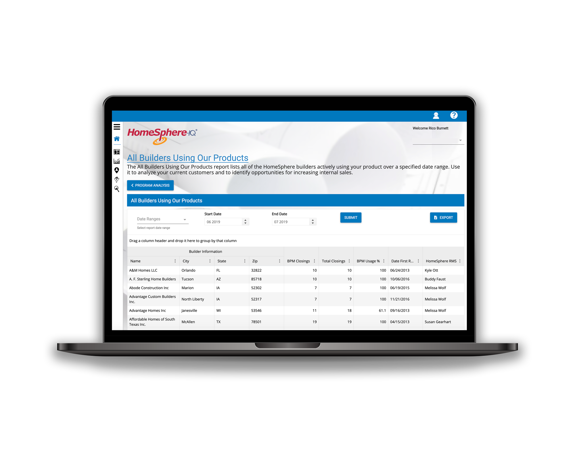
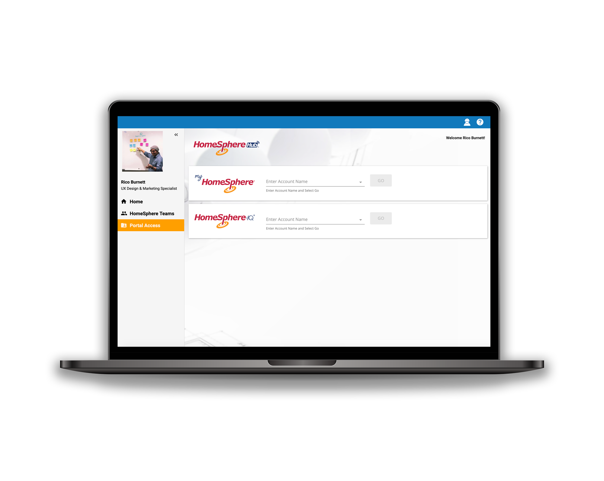
Awarded Constructech Top Product of 2019 and 2020, HomeSphere-IQ is an innovative app that helps manufacturers find new builder business, track product usage of their current customers and helps them foster brand loyalty through rebates and data.
Why Design It?
HomeSphere partners with over 80+ building product manufacturers across the nation. These manufacturers had an outdated tool that provided them with information about their program but not in the most actionable way.
A new modern tool needed to be designed to meet the current and future needs of the manufacturer while also the business goals of HomeSphere. This needed to be done swiftly in order keep up with demand and be first to market over the competition.
Some pain points addressed were visibility into the program, lack of enterprise involvement, lack of clear opportunities for sales teams with home builders, no clear way to monitor and retain current and newly converted customers and the partners not understanding the value of the program to their business.
This tool needed to be designed to solve the pain of manufacturers and help HomeSphere retain current customers. The tool needed to provide them with actionable data and value that would be unmatched by our competition.
Working with our small but mighty team, I worked as the sole UX/UI designer (before I received a promotion) and was able to design a solution that was officially awarded one of Constructech’s Top Products of 2019.
I currently work as the sole UX Design and Marketing Specialist to handling both UX/UI Design and Digital Marketing.
How Was It Designed?
User Research
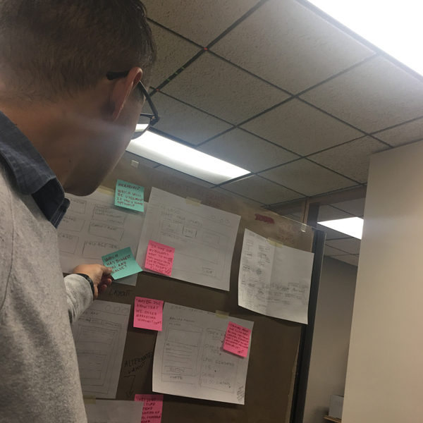
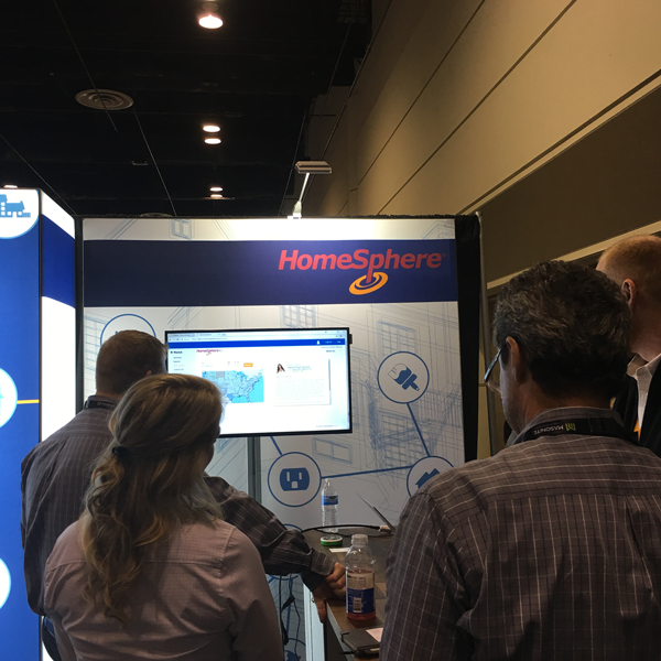
We interviewed various current customers and potential customers to understand how they went about their process and where their major pain points were. Where they had the most challenges was where we focused our time and efforts. Once we refined how our solutions into high-fidelity prototypes we took to home buildings largest trade show, the International Builders Show in Orlando Florida 2018. There we put prototypes into the hands of our customers and prospects to give us valuable feedback on how these tools could help them in their everyday processes. This also provided an opportunity to further validate any assumptions we had about feature needs and usability.
Marketing and Validating it’s Demand and Need
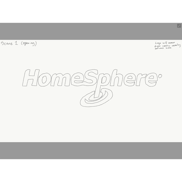
This video was used to market the product and get early buy in from varying customers, both current and prospective. This video is unique to the process and I took complete on it. I filmed, directed, animated, produced music and narrated this project. Creating it served as a tool to validate the demand of certain features by selling futures. It helped us to gain early buy in from our key partners so we could develop this game changing technology for them as well as our future customers in the building product manufacturing space.
The prototypes seen in the video were designed and used with the key audience at the International Builders Show in Orlando in 2018. This gave us a way to do further user research, usability tests and and also sell the future to existing customers and get their buy in.
Wire-Framing and Prototyping
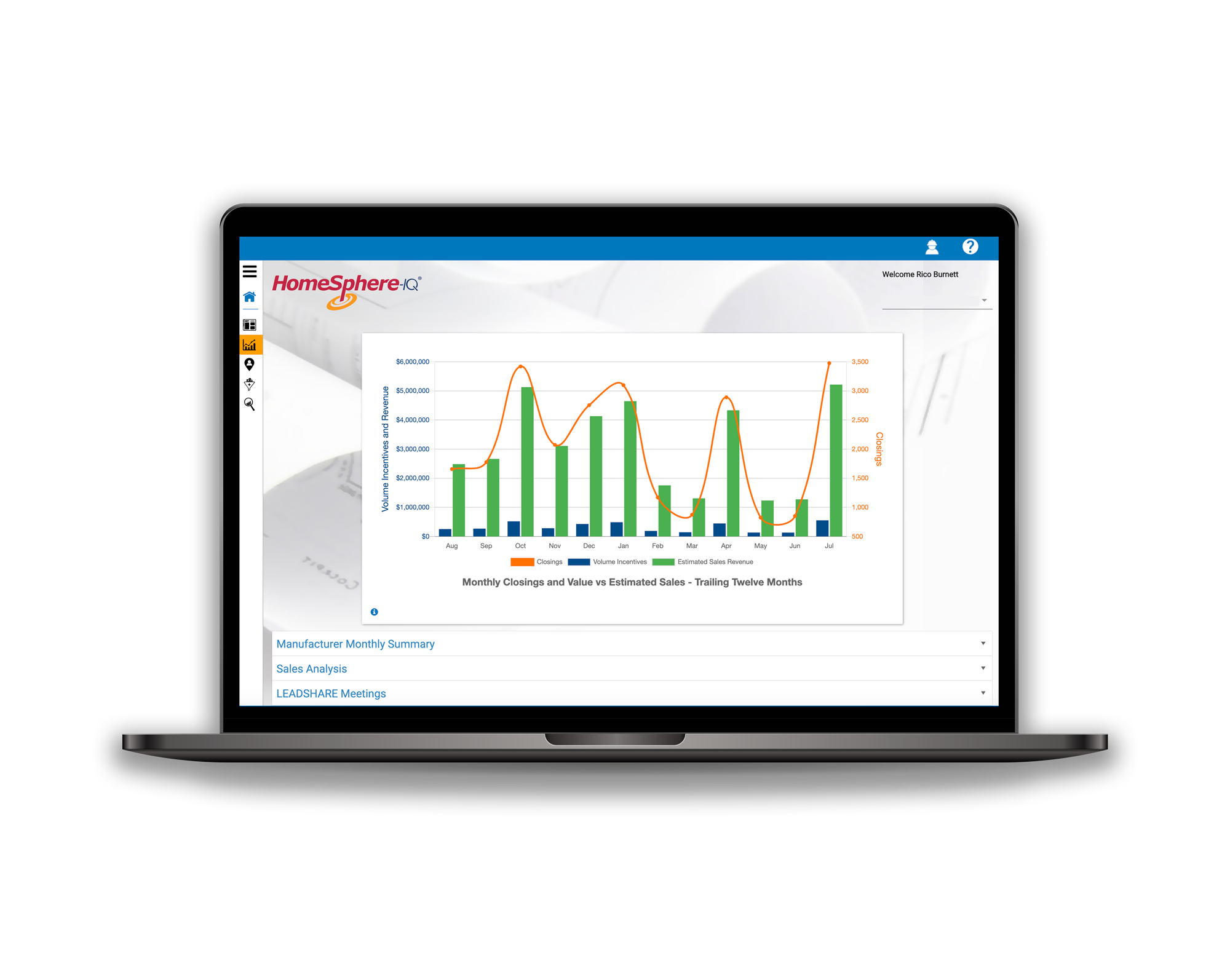
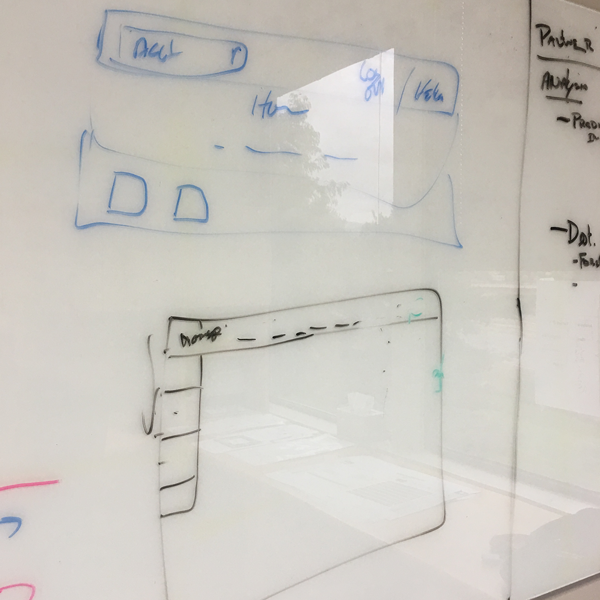
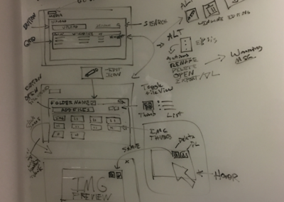
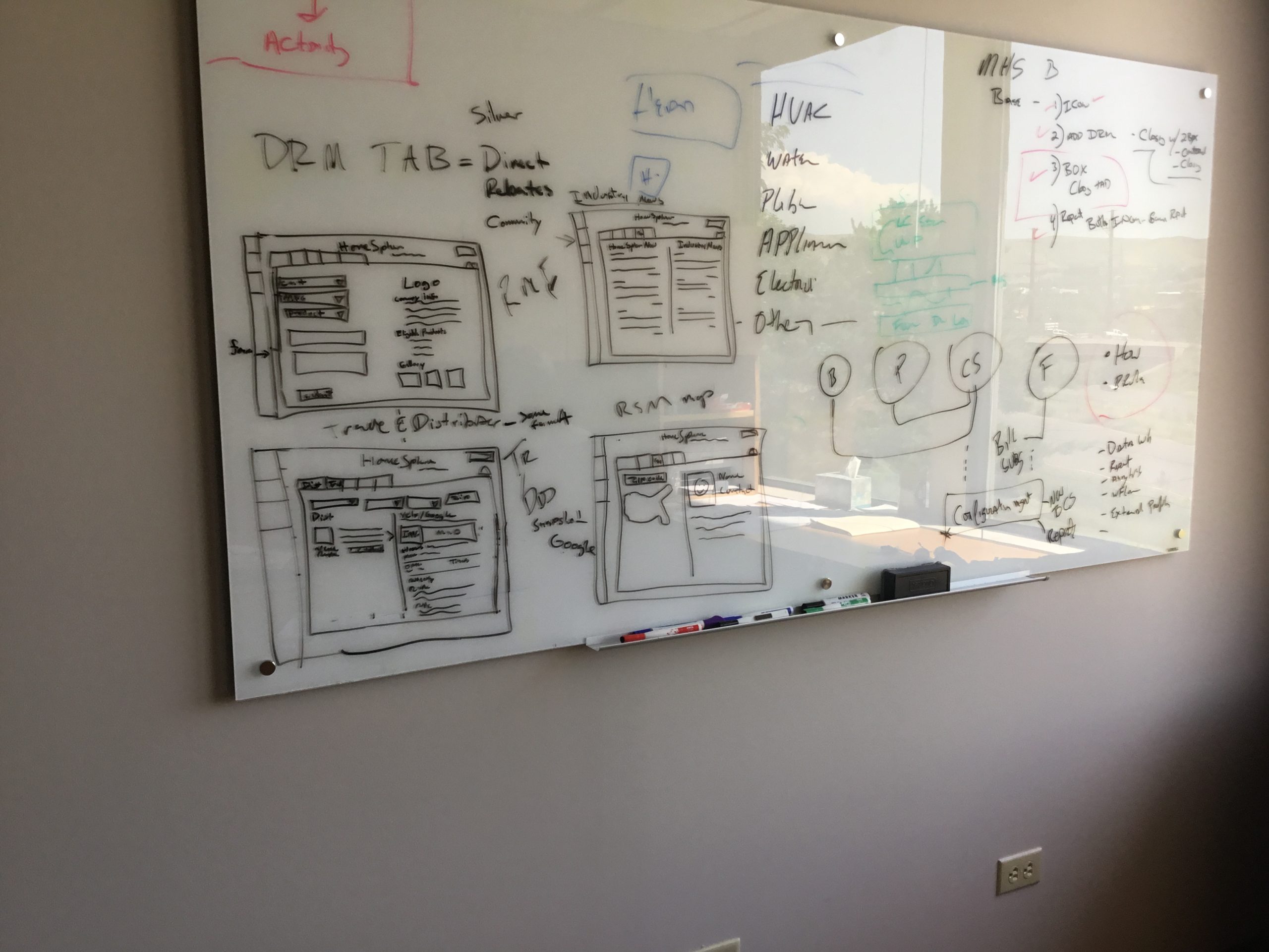
We took customer feedback and findings to design high priority features that would bring the most value to the customer and give both HomeSphere and HomeSphere-IQ users the best possible ROI. The main challenges we faced were nailing down the core design and layout in a format that made the most sense for the current customers and their needs. We focused heavily on a desktop friendly design due to the fact that most of our target audience worked on related tasks via desktop about 80% of the time.
The design of all the icons was intended to give the product a home construction centric look and feel. We wanted to incorporate it’s personality even in the smallest details of the application. This also allowed me to give the tool a custom look and feel that was unique to HomeSphere’s brand and the product itself.
I’ve provided examples of the icons that were designed for the application. These icons were used to provide simple collapsed navigation for the sidebar and heuristic approach to non-labeled sections of the application.
Branding the product
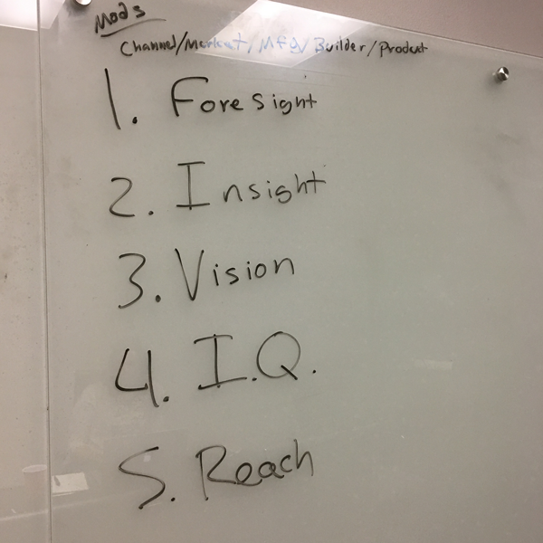
The product needed branding that felt cohesive to the overall company brand, and conveyed the value of the tool to customers. This took time to collaborate with the minds in marketing to land on a name that could easily roll off the tongue and relate to what the product can do for the user.
Once we landed on a name, I designed an original logo and redesigned the primary brand logo to have a refreshed look and feel that could balance with the companies new direction.
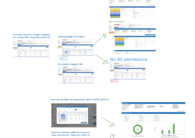
Here are a few pieces from the process.
Design Results
Once this product was designed, users began to adopt the new product in order to find new customers, manage their program and market their brand. After gradual improvements and introduction from 2018 to 2019 there were several big increases in KPI’s that prove out the value and success of the platform. However their were findings for places to improve. Customers enjoyed the UX and found no problems with it but they did have challenges because the industry prefers a more person to person approach to their everyday business.
%
MAU Increase
%
SAAS Revenue Growth YOY
See More of My Work
Featured Project
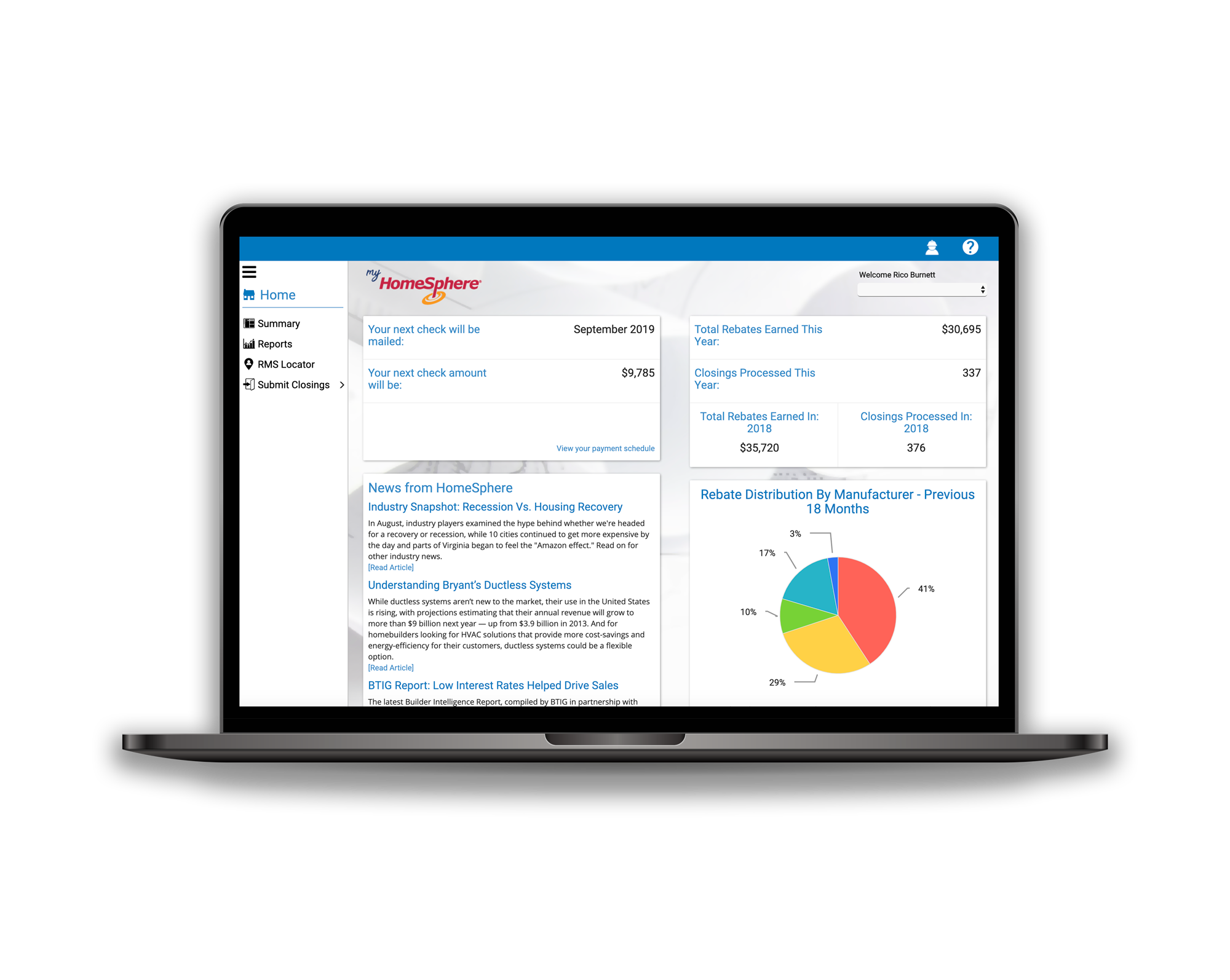
My HomeSphere
I worked on the redesign of this award winning app. This app was designed to innovate the way home builders discover products and manage their businesses rebate program.

