With These Fighting Hands
With These Fighting Hands is a non-profit organization based in Aurora CO. They help youth athletes get funding to participate in sports, get the training they need and provide them with opportunities for growth and a positive outlets.
Featured Project
WithTheseFightingHands.org
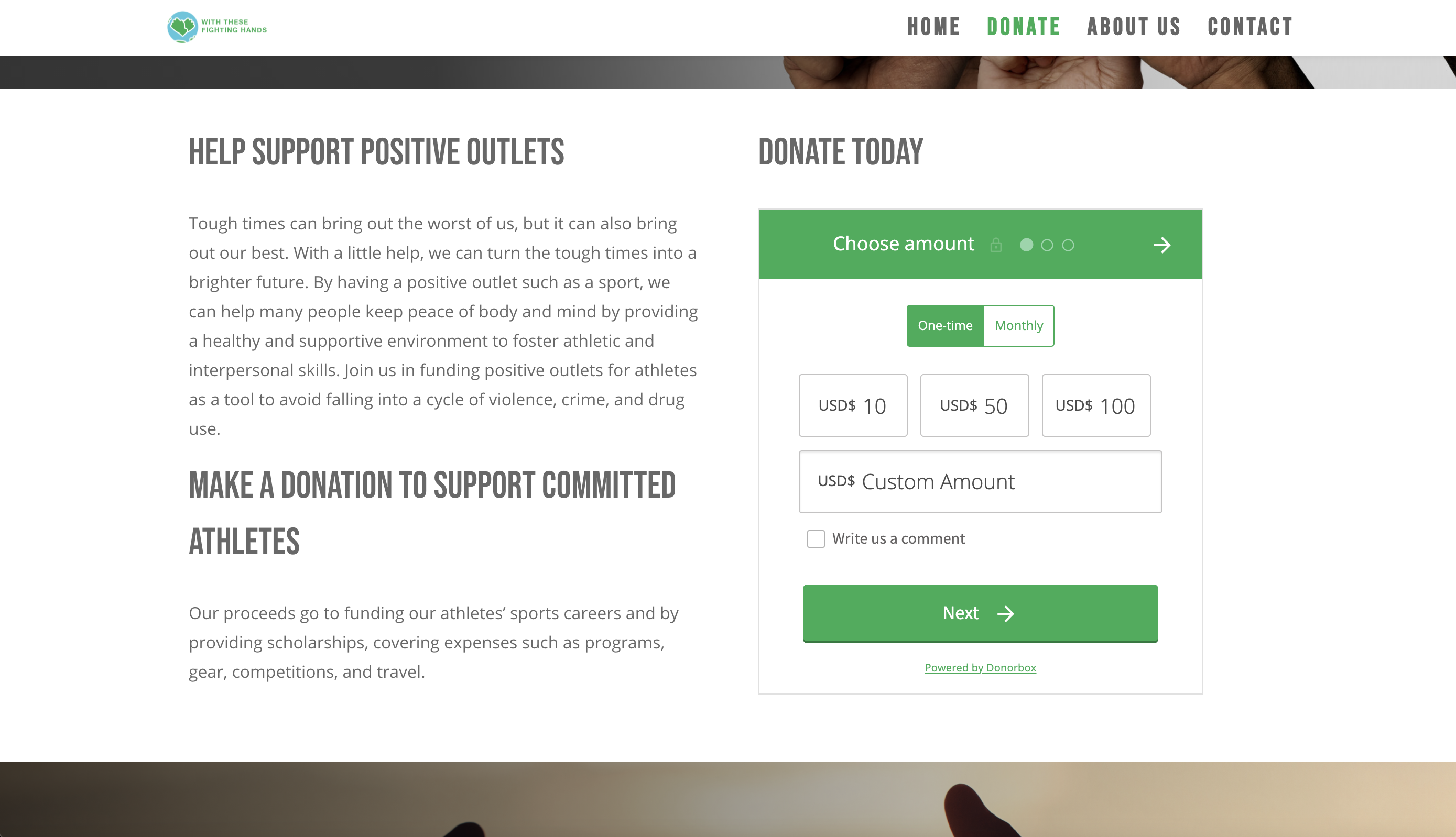
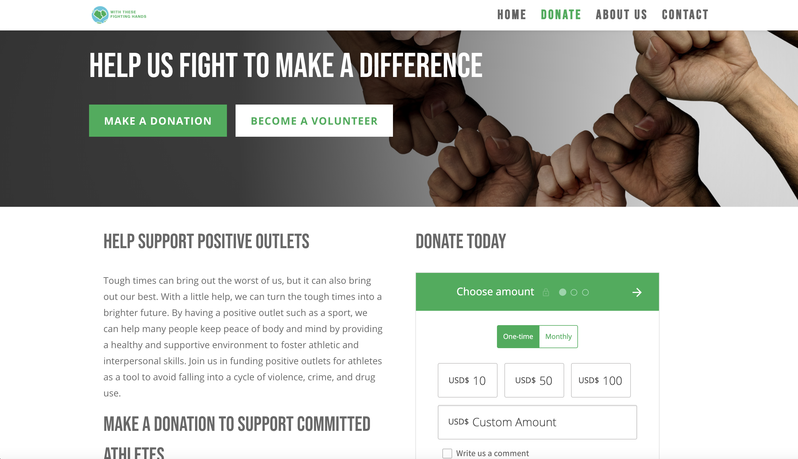
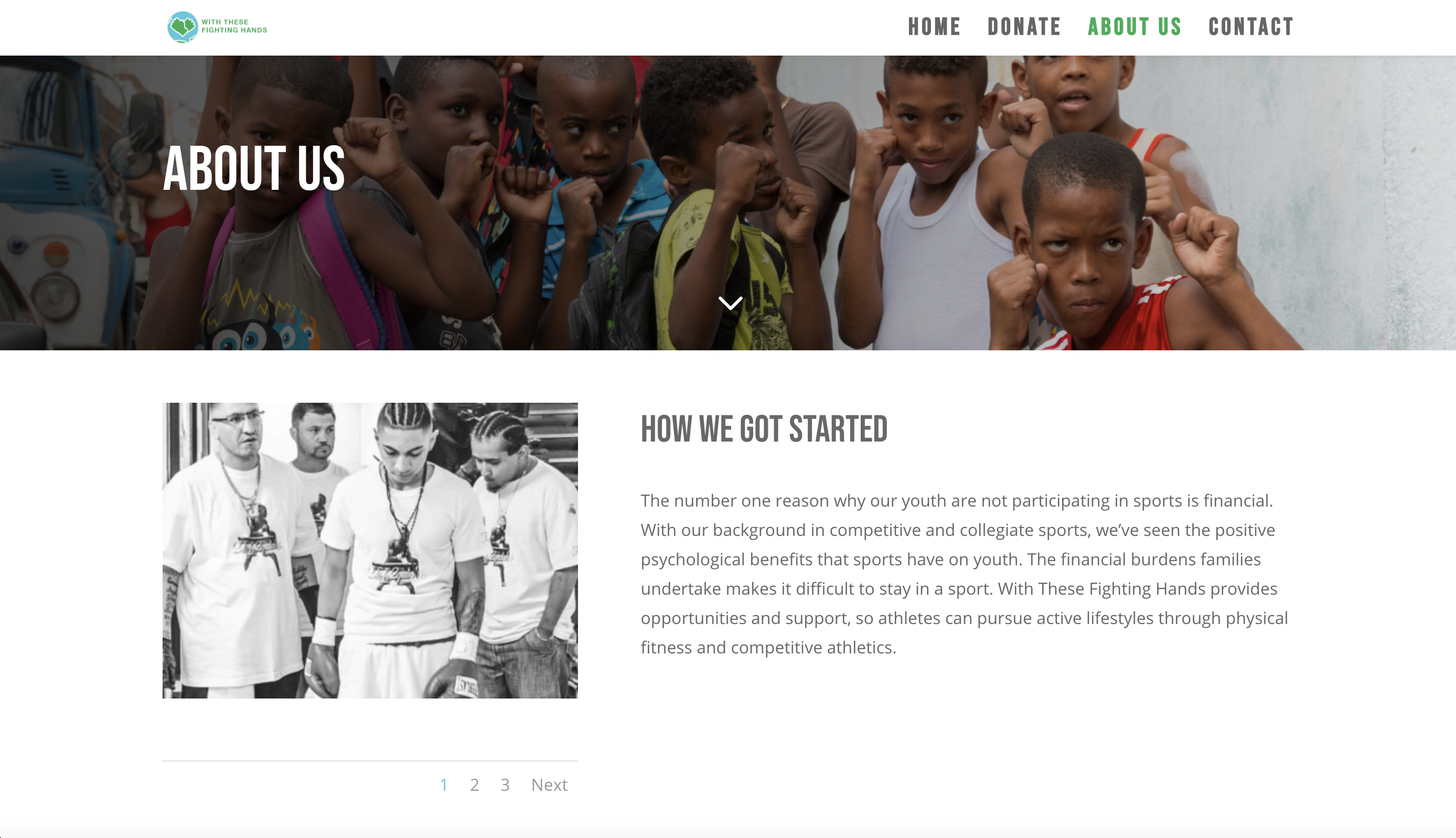
Withthesefightinghands.com was built from the ground up. We worked on everything from UX, Website Design and Branding.
Why Design It?
In order for the organization to become a qualified non-profit they needed a website. They also needed a way to collect donations to fund the organization and begin putting funding toward helping future athletes.
Client Goals:
Have a brand that embodied some of their organizations core values:
They wanted to have a brand that fit with their goal to help athletes and have a feeling of being inclusive and forward thinking. They wanted to have room for them to expand outside of their local area and wanted more of a global feel to their brand.
Mobile friendly design:
The organization wanted to be sure that their site was mobile friendly so they could be accessible from anywhere.
Accept donation funds:
Being a brand new organization they wanted a safe and secure way to allow visitors to start donating funds.
Collect subscribers and build up a list to market to:
The organization has a goal to generate more email subscribers. This allows them to keep in touch with their community of advocates and donors. Giving a way for those who have newly discovered their organization to learn more and be reminded about future events, athletes and ways to give.
How Was It Designed?
Customer Research
Our client is a non-profit and their budget was more focused as they were just starting out. So we focused on their personal goals and intereviewed them about what they’re needs were as a business. We learned that being new, they wanted to make sure people knew who they were, what they do and how they can contribute donations or get in touch with the organization to get involved. This informed how CTA’s were placed on the page and how we designed this site for easy navigation. We will continue working with them so we can define an even better customer experience going forward as their site expands to include more features in the near future.
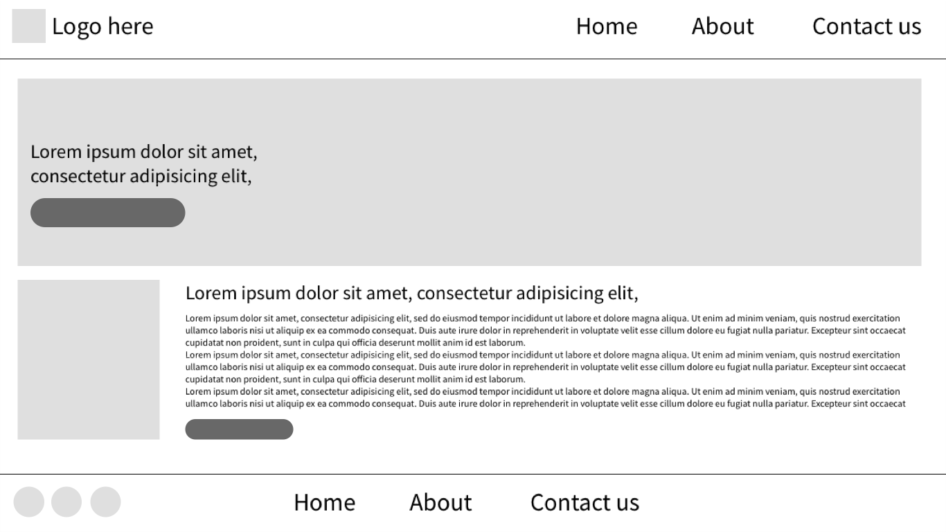
Wire-Framing for With These Fighting Hands
The client had a short timeline to get up and running. As a new non-profit we quickly worked with them to apply some design principles that would assist them in having a quality website in a timely manner. I created some low-fidelity mockups to generate a conversation about what they expected their website to do and accomplish for them. This allowed me to get a feel for what they needed specifically to reach their goals.
Building the Website
We built the site on a WordPress to allow them to have a strong amount of flexibility for functionality that they may want to incorporate in the future. We used plug-ins that allowed them to sync with a secure donation application called donorbox. This allowed us to easily help them start collecting money from donors. The first day their site was live they received a few nice donations to start them off on the right foot. I also customized this component to match the look and feel of the brand.
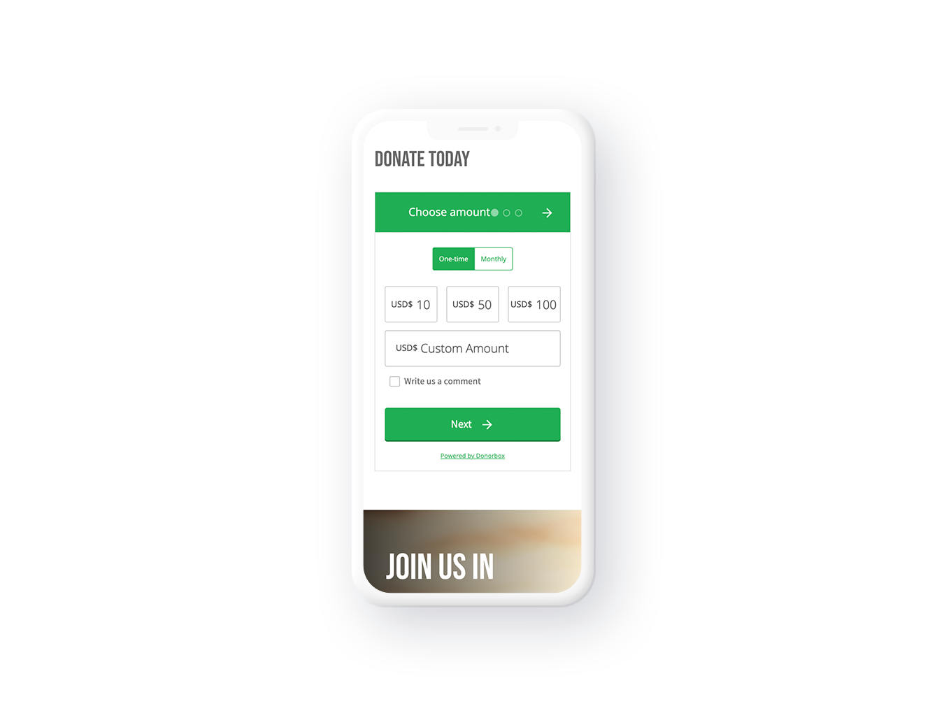
Making the site mobile friendly.
The site needed to meet the needs of the client in the mobile friendly department, so we used a common hamburger menu with large clear CTA’s. This way users who were navigating the flow of the site could quickly identify where they wanted to go if the hamburger menu wasn’t open. The CTA’s focused on the most important pages to take a user to for action. These pages were contact/get involved and donate. With the non-profit, these are the most important actions to help the organization have a focused goal for visitors.
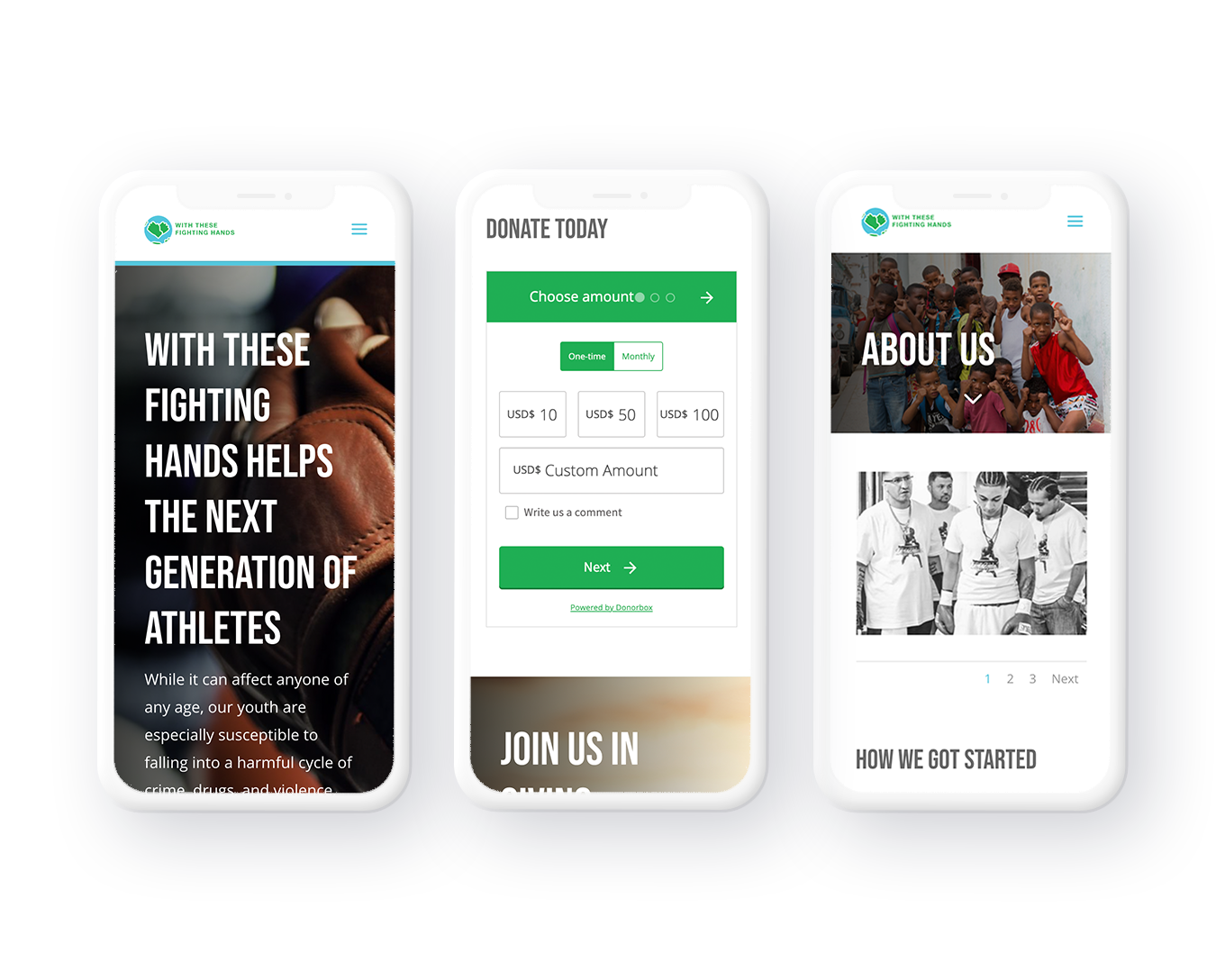
Results of the redesign:
I just designed and built this website recently so we are currently tracking and analyzing the data for the site. Our goal is to have an average session duration of at least 1:30. At this point the site is going to undergo more modifications in the near future and I will make optimizations based on the findings.
See More of My Work
Featured Project
My HomeSphere
I worked on the redesign of this award winning app. This app was designed to innovate the way home builders discover products and manage their businesses rebate program.

